-
[Flutter] Material Design Components - layout (app bar / navigation)앱 개발/Flutter 2021. 1. 11. 15:38반응형
최근 좀 더 컨텐츠에 집중할 수 있는 디자인이 트렌드이기 때문에
창의적인 디자인과 개발가능한 디자인 사이를 고민해야한다.
그 중 개발 친화적인 디자인의 표본이라고 생각하는 design system인
material design 요소들과 flutter 코드를 정리해보려 한다.
더 자세하고 다양한 design 적인 요소들을 보기 위해서는
아래의 링크에 들어가서 항목을 찾으면 된다.
material.io/components/app-bars-bottom
Material Design
Build beautiful, usable products faster. Material Design is an adaptable system—backed by open-source code—that helps teams build high quality digital experiences.
material.io
Material Design Components - layout
package:flutter/material.dart< 항목 >
1. Bottom app bar
2. Top app bar
3. Banner
4. Bottom navigation
5. Navigation drawer
6. Navigation rail1. Bottom app bar
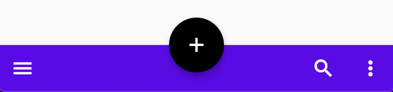
Scaffold(
  bottomNavigationBar: BottomAppBar(
    child: Row(
      children: [
        IconButton(icon: Icon(Icons.menu), onPressed: () {}),
        Spacer(),
        IconButton(icon: Icon(Icons.search), onPressed: () {}),
        IconButton(icon: Icon(Icons.more_vert), onPressed: () {}),
      ],
    ),
  ),
  floatingActionButton:
      FloatingActionButton(child: Icon(Icons.add), onPressed: () {}),
  floatingActionButtonLocation: FloatingActionButtonLocation.centerDocked,
),
2. Top app bar
Regular & Prominent (제목이 길 때 주로 사용)
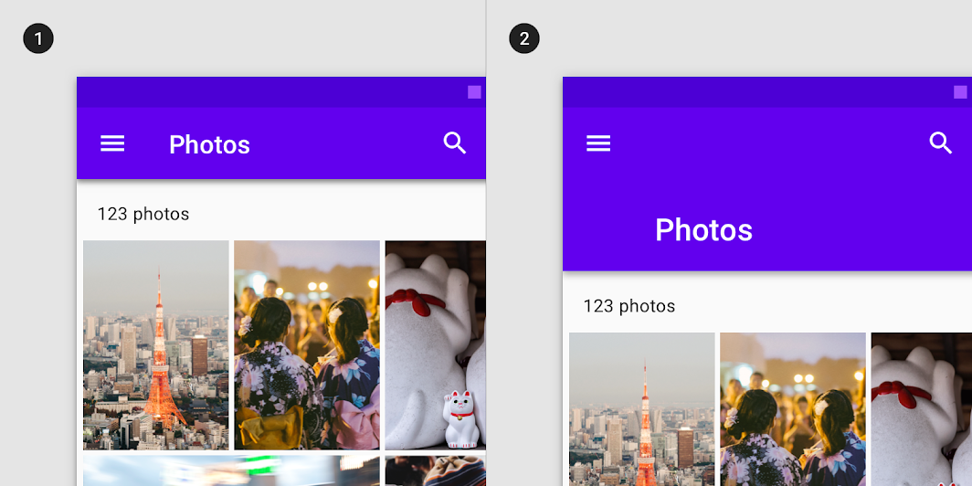
1) Regular top app bar

AppBar(
  leading: Icon(Icons.menu),
  title: Text('Page title'),
  actions: [
    Icon(Icons.favorite),
    Padding(
      padding: EdgeInsets.symmetric(horizontal: 16),
      child: Icon(Icons.search),
    ),
    Icon(Icons.more_vert),
  ],
  backgroundColor: Colors.purple,
),
2) Contextual action bar
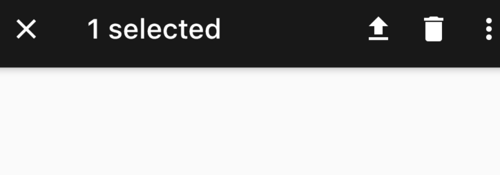
AppBar(
  leading: Icon(Icons.close),
  title: Text('1 selected'),
  actions: [
    Icon(Icons.file_upload),
    Padding(
      padding: EdgeInsets.symmetric(horizontal: 16),
      child: Icon(Icons.delete),
    ),
    Icon(Icons.more_vert),
  ],
  backgroundColor: Colors.black87,
),
3. Backdrop (beta)
아래의 코드랩에 backdrop 사용 예시코드가 있다.
codelabs.developers.google.com/codelabs/mdc-104-flutter#3
MDC-104 Flutter: Material Advanced Components (Flutter)
Improve your design and learn to use our advanced component backdrop menu for Flutter.
codelabs.developers.google.com
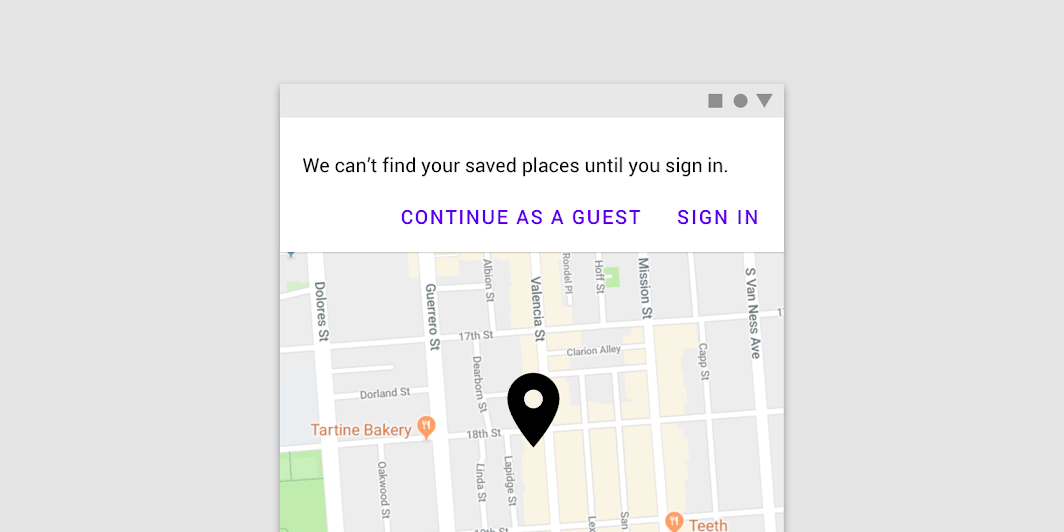
4. Banner
눈에 잘 띄는 메세지와 관련 옵션 작업을 표시
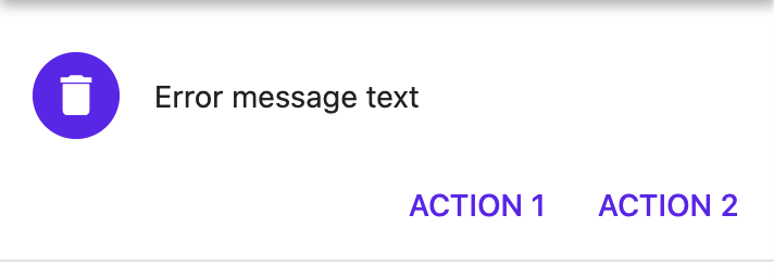
MaterialBanner(
        content: const Text('Error message text'),
        leading: CircleAvatar(child: Icon(Icons.delete)),
        actions: [
          FlatButton(
            child: const Text('ACTION 1'),
            onPressed: () { },
          ),
          FlatButton(
            child: const Text('ACTION 2'),
            onPressed: () { },
          ),
        ],
      ),
5. Bottom navigation
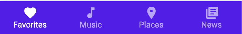
BottomNavigationBar(
  type: BottomNavigationBarType.fixed,
  backgroundColor: Color(0xFF6200EE),
  selectedItemColor: Colors.white,
  unselectedItemColor: Colors.white.withOpacity(.60),
  selectedFontSize: 14,
  unselectedFontSize: 14,
  onTap: (value) {
          setState(() => _currentIndex = value);
        },
  items: [
    BottomNavigationBarItem(
      title: Text('Favorites'),
      icon: Icon(Icons.favorite),
    ),
    BottomNavigationBarItem(
      title: Text('Music'),
      icon: Icon(Icons.music_note),
    ),
    BottomNavigationBarItem(
      title: Text('Places'),
      icon: Icon(Icons.location_on),
    ),
    BottomNavigationBarItem(
      title: Text('News'),
      icon: Icon(Icons.library_books),
    ),
  ],
)
6. Navigation drawer
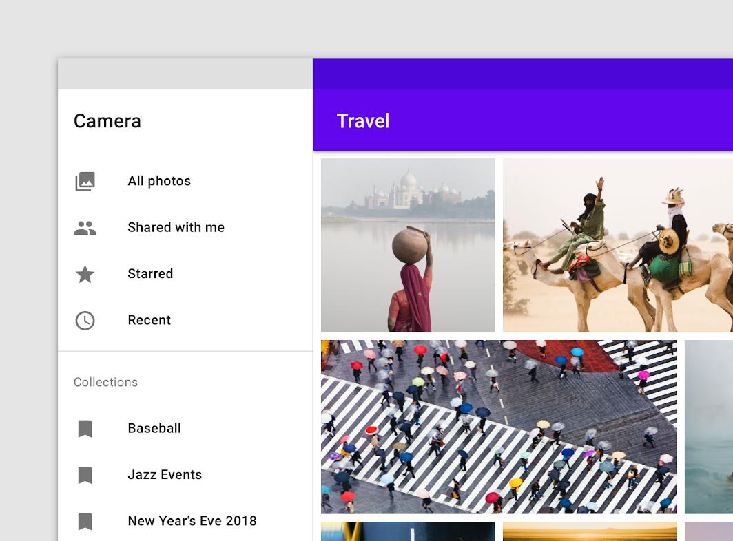
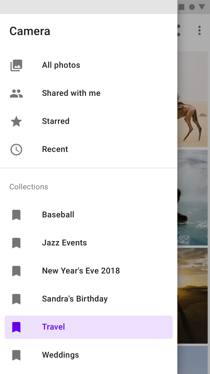
1) standard drawer
- 피씨와 태블릿에서 영구적으로 보이게 할 수 있음 단, 모바일에서는 불가능
- Drawer를 앱 주요 화면이 될 Scaffold와 row로 배열한다.
  @override
  Widget build(BuildContext context) {
    final theme = Theme.of(context);
    final textTheme = theme.textTheme;

    return Row(
      children: [
        Drawer(
          child: ListView(
            // Important: Remove any padding from the ListView.
            padding: EdgeInsets.zero,
            children: <Widget>[
              Padding(
                padding: const EdgeInsets.all(16.0),
                child: Text(
                  'Header',
                  style: textTheme.headline6,
                ),
              ),
              Divider(
                height: 1,
                thickness: 1,
              ),
              ListTile(
                leading: Icon(Icons.favorite),
                title: Text('Item 1'),
                selected: _selectedDestination == 0,
                onTap: () => selectDestination(0),
              ),
              ListTile(
                leading: Icon(Icons.delete),
                title: Text('Item 2'),
                selected: _selectedDestination == 1,
                onTap: () => selectDestination(1),
              ),
              ListTile(
                leading: Icon(Icons.label),
                title: Text('Item 3'),
                selected: _selectedDestination == 2,
                onTap: () => selectDestination(2),
              ),
              Divider(
                height: 1,
                thickness: 1,
              ),
              Padding(
                padding: const EdgeInsets.all(16.0),
                child: Text(
                  'Label',
                ),
              ),
              ListTile(
                leading: Icon(Icons.bookmark),
                title: Text('Item A'),
                selected: _selectedDestination == 3,
                onTap: () => selectDestination(3),
              ),
            ],
          ),
        ),
        VerticalDivider(
          width: 1,
          thickness: 1,
        ),
        Expanded(
          child: Scaffold(
            appBar: AppBar(
              title: Text(widget.title),
            ),
            body: GridView.count(
              crossAxisCount: 2,
              crossAxisSpacing: 20,
              mainAxisSpacing: 20,
              padding: EdgeInsets.all(20),
              childAspectRatio: 3 / 2,
              children: [
                Image.asset('assets/nav-drawer-1.jpg'),
                Image.asset('assets/nav-drawer-2.jpg'),
                Image.asset('assets/nav-drawer-3.jpg'),
                Image.asset('assets/nav-drawer-4.jpg'),
              ],
            ),
          ),
        ),
      ],
    );
  }
2) Modal drawer
- 열고 닫을 수 있으며 피씨 , 태블릿에서는 standard로 변환 가능
  @override
  Widget build(BuildContext context) {
    final theme = Theme.of(context);
    final textTheme = theme.textTheme;

    return Scaffold(
      appBar: AppBar(
        title: Text(widget.title),
      ),
      drawer: Drawer(
        child: ListView(
          // Important: Remove any padding from the ListView.
          padding: EdgeInsets.zero,
          children: <Widget>[
            Padding(
              padding: const EdgeInsets.all(16.0),
              child: Text(
                'Header',
                style: textTheme.headline6,
              ),
            ),
            Divider(
              height: 1,
              thickness: 1,
            ),
            ListTile(
              leading: Icon(Icons.favorite),
              title: Text('Item 1'),
              selected: _selectedDestination == 0,
              onTap: () => selectDestination(0),
            ),
            ListTile(
              leading: Icon(Icons.delete),
              title: Text('Item 2'),
              selected: _selectedDestination == 1,
              onTap: () => selectDestination(1),
            ),
            ListTile(
              leading: Icon(Icons.label),
              title: Text('Item 3'),
              selected: _selectedDestination == 2,
              onTap: () => selectDestination(2),
            ),
            Divider(
              height: 1,
              thickness: 1,
            ),
            Padding(
              padding: const EdgeInsets.all(16.0),
              child: Text(
                'Label',
              ),
            ),
            ListTile(
              leading: Icon(Icons.bookmark),
              title: Text('Item A'),
              selected: _selectedDestination == 3,
              onTap: () => selectDestination(3),
            ),
          ],
        ),
      ),
      body: GridView.count(
        crossAxisCount: 2,
        crossAxisSpacing: 20,
        mainAxisSpacing: 20,
        padding: EdgeInsets.all(20),
        childAspectRatio: 3 / 2,
        children: [
          Image.asset('assets/nav-drawer-1.jpg'),
          Image.asset('assets/nav-drawer-2.jpg'),
          Image.asset('assets/nav-drawer-3.jpg'),
          Image.asset('assets/nav-drawer-4.jpg'),
        ],
      ),
    );
3) bottom drawer
- BottomAppBar 내에 적용함
- document 참고할 것
7. Navigation rail
- material document에 flutter 코드가 없음으로 document 참고할 것

  @override
  Widget build(BuildContext context) {
    return Scaffold(
      body: Row(
        children: <Widget>[
          NavigationRail(
            selectedIndex: _selectedIndex,
            onDestinationSelected: (int index) {
              setState(() {
                _selectedIndex = index;
              });
            },
            labelType: NavigationRailLabelType.selected,
            destinations: [
              NavigationRailDestination(
                icon: Icon(Icons.favorite_border),
                selectedIcon: Icon(Icons.favorite),
                label: Text('First'),
              ),
              NavigationRailDestination(
                icon: Icon(Icons.bookmark_border),
                selectedIcon: Icon(Icons.book),
                label: Text('Second'),
              ),
              NavigationRailDestination(
                icon: Icon(Icons.star_border),
                selectedIcon: Icon(Icons.star),
                label: Text('Third'),
              ),
            ],
          ),
          VerticalDivider(thickness: 1, width: 1),
          // This is the main content.
          Expanded(
            child: Center(
              child: Text('selectedIndex: $_selectedIndex'),
            ),
          )
        ],
      ),
    );
  }
api.flutter.dev/flutter/material/NavigationRail-class.html
NavigationRail class - material library - Dart API
A material widget that is meant to be displayed at the left or right of an app to navigate between a small number of views, typically between three and five. The navigation rail is meant for layouts with wide viewports, such as a desktop web or tablet land
api.flutter.dev
반응형'앱 개발 > Flutter' 카테고리의 다른 글
[Flutter] 플러터 2.0 버튼 hover, pressed, focused, disable, overlay 상태(state) 변화 개발 (0) 2021.07.30 [Flutter] 플러터 버튼 종류 (TextButton / OutlinedButton / ElevatedButton / Icon button) (1) 2021.01.18 flutter 차트 패키지 (syncfusion_flutter_charts) (0) 2021.01.04 [FLUTTER] 스크린 방향 설정 (0) 2020.01.21 [FLUTTER/Firebase] Firestore 연동 데이터 쿼리 설명 및 코드 (0) 2019.12.31